
AFCD
Annual Report 22-23
/ web-based

My Role
Competitor Analysis, Wireframe, UIUX Design, Prototype
Duration
12 weeks
Tools
Figma
Project Overview
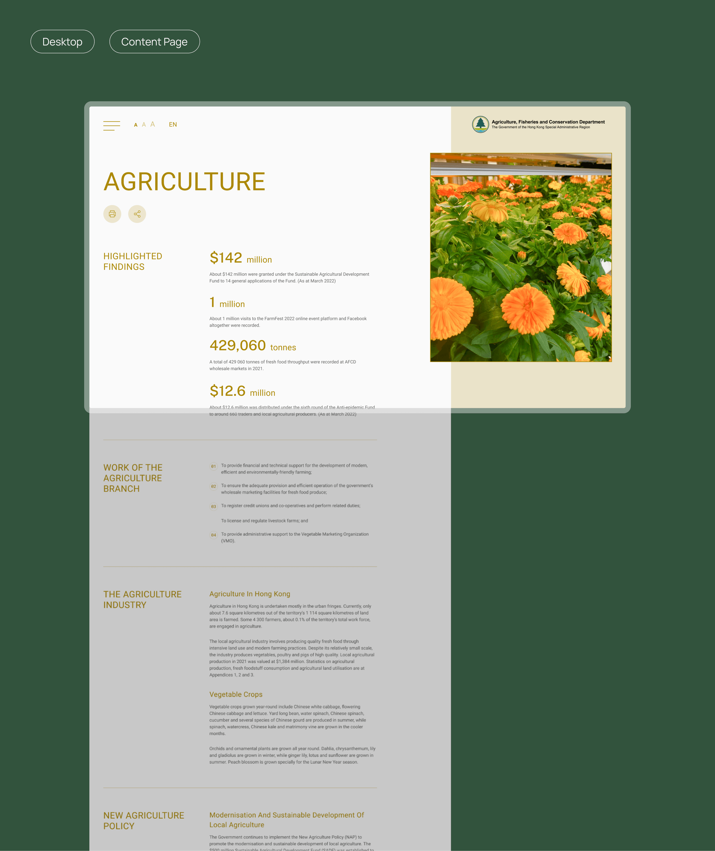
The Agriculture, Fisheries and Conservation Department (AFCD) in Hong Kong manages policies on agriculture, fisheries, and conservation. Their annual report showcases achievements across five branches.
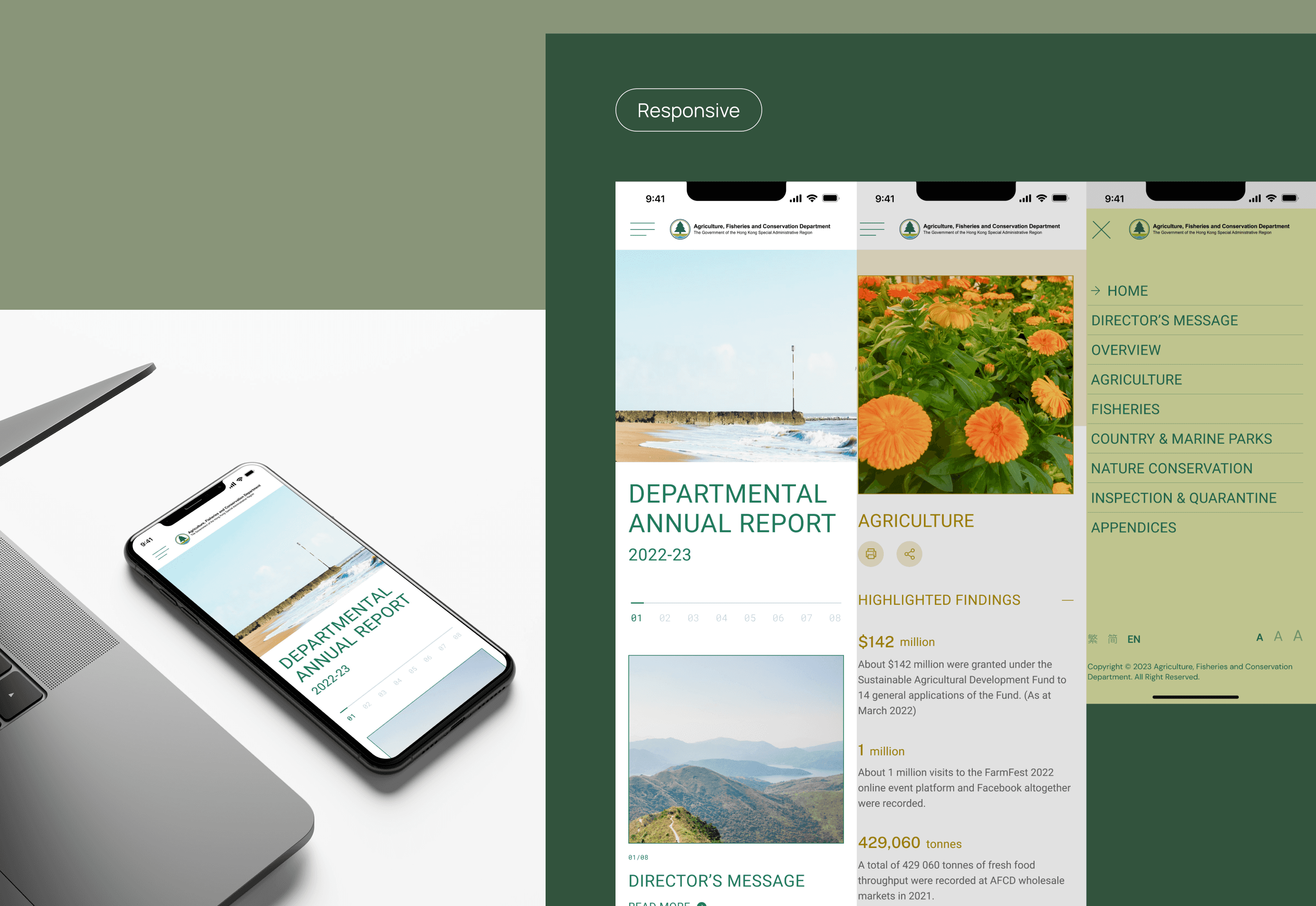
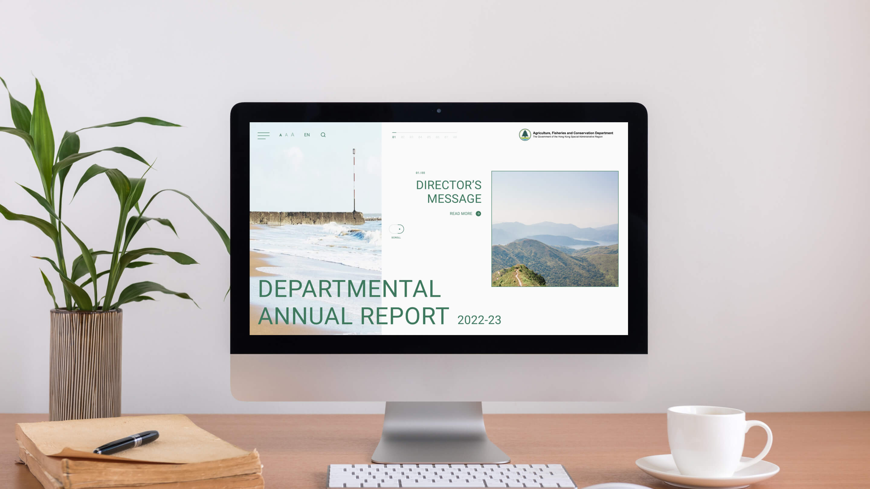
My goal was to modernize its online version with a clean, intuitive interface and a color-coded navigation system for better user experience.
The Challenge
Problems
The existing online annual report effectively presented AFCD’s achievements but had opportunities for improvement in visual appeal and user navigation.
The layout, while functional, could be refined to align more closely with contemporary design trends and AFCD’s brand identity.
Enhancing engagement through a more interactive and user-friendly approach would further strengthen its impact.
The Solution
Color-Coding Strategy
Each branch was assigned a distinct color for easy navigation and content organization.
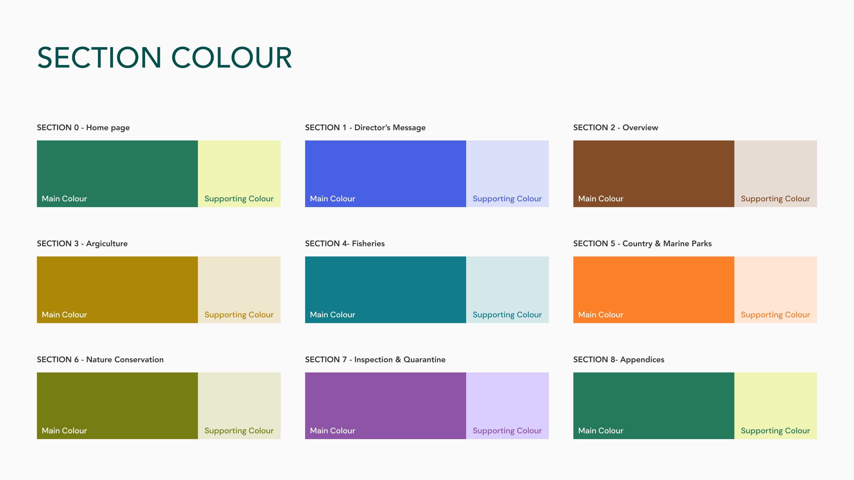


Reinforcing AFCD’s Green and Innovative Image
A nature-inspired color palette emphasized sustainability.
A refined visual hierarchy improved readability.
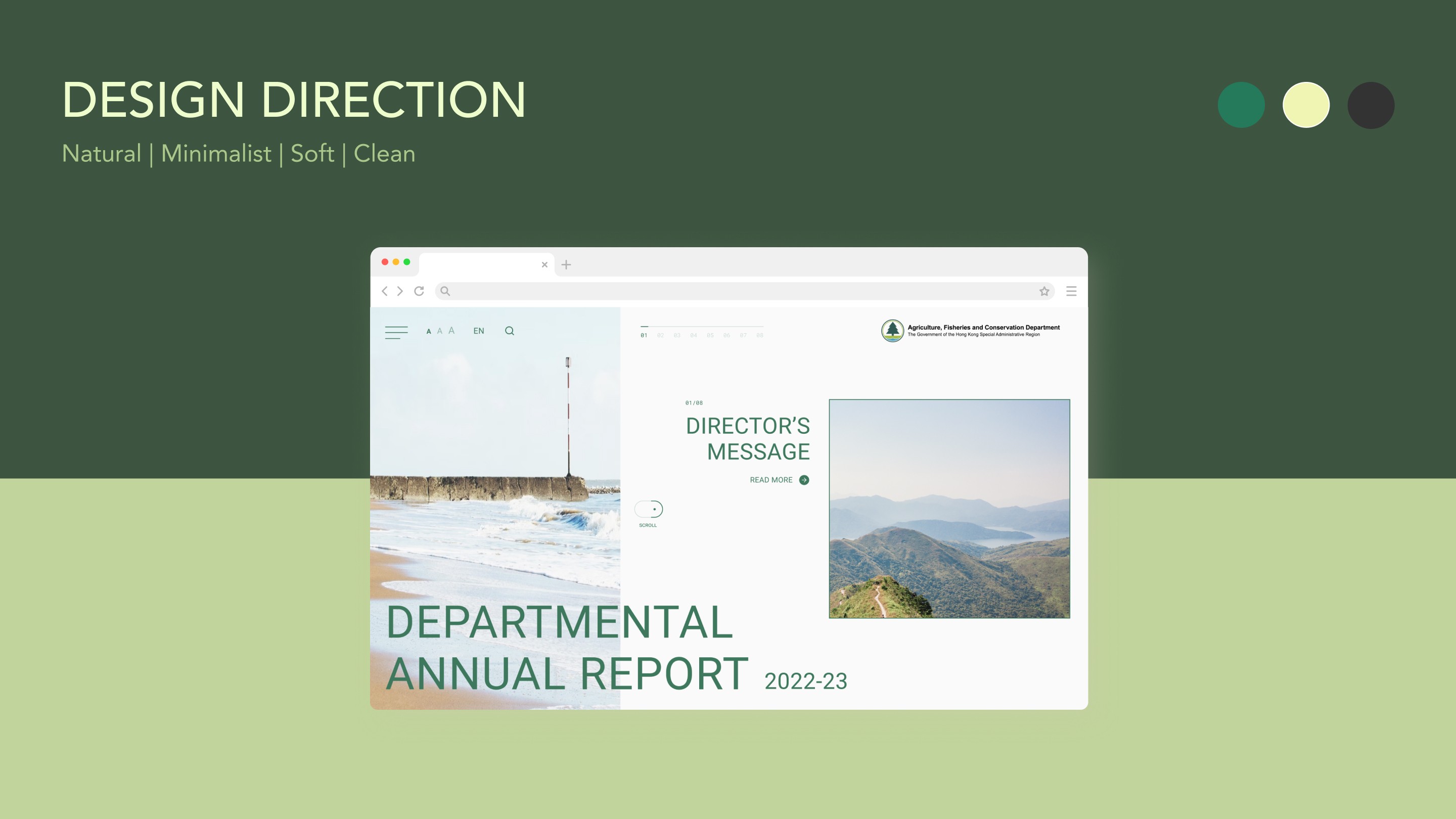
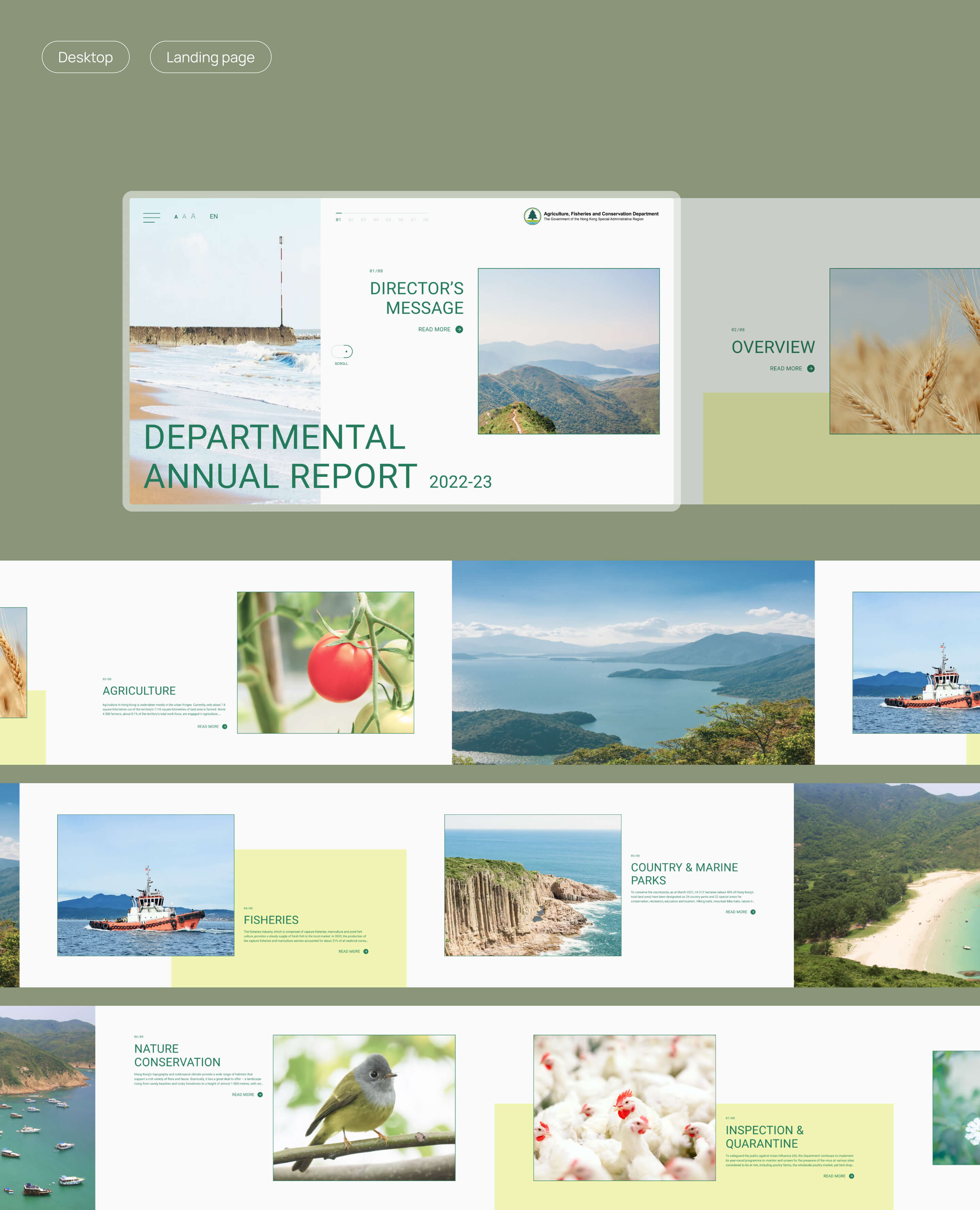
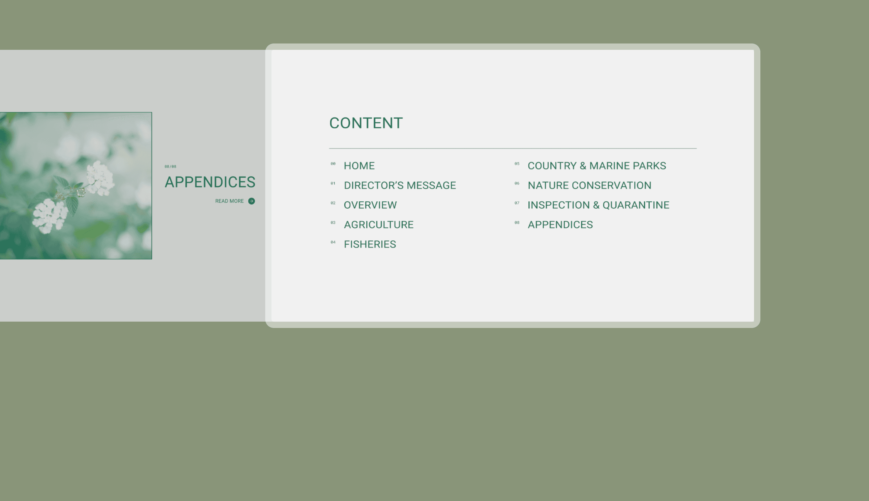
Clean and Intuitive Interface
A horizontal layout introduced a fresh contrast to previous designs.
A refined visual hierarchy improved readability.

Takeaways
Strengthening Presentation Skills
This project was a turning point in my ability to present design solutions effectively. One of the biggest challenges wasn’t just the redesign itself but how to communicate my design decisions in a way that resonated with stakeholders.
I focused on simplifying complex ideas, making UX/UI design accessible to all audiences. Seeing non-design stakeholders truly grasp the impact of UX/UI design is the the most rewarding part of the project.
< more to go >


< FEEL FREE TO REACH OUT >
AFCD
Annual Report 22-23
/ web-based
My Role
Competitor Analysis, Wireframe, UIUX Design, Prototype
Duration
12 weeks
Tools
Figma
Project Overview
The Agriculture, Fisheries and Conservation Department (AFCD) in Hong Kong manages policies on agriculture, fisheries, and conservation. Their annual report showcases achievements across five branches.
My goal was to modernize its online version with a clean, intuitive interface and a color-coded navigation system for better user experience.
The Challenge
Problems
The existing online annual report effectively presented AFCD’s achievements but had opportunities for improvement in visual appeal and user navigation.
The layout, while functional, could be refined to align more closely with contemporary design trends and AFCD’s brand identity.
Enhancing engagement through a more interactive and user-friendly approach would further strengthen its impact.
The Solution
Color-Coding Strategy
Each branch was assigned a distinct color for easy navigation and content organization.
Reinforcing AFCD’s Green and Innovative Image
A nature-inspired color palette emphasized sustainability.
A refined visual hierarchy improved readability.
Clean and Intuitive Interface
A horizontal layout introduced a fresh contrast to previous designs.
A refined visual hierarchy improved readability.
Takeaways
Strengthening Presentation Skills
This project was a turning point in my ability to present design solutions effectively. One of the biggest challenges wasn’t just the redesign itself but how to communicate my design decisions in a way that resonated with stakeholders.
I focused on simplifying complex ideas, making UX/UI design accessible to all audiences. Seeing non-design stakeholders truly grasp the impact of UX/UI design is the the most rewarding part of the project.
< more to go >
< FEEL FREE TO REACH OUT >